
Abandon The 3 Click Rule to Create A More Effortless Experience
As builders of the web, whether we are on the design or development side, we’ve all at some point come across the “3-Click Rule,” which states, that if users have to click more than 3 times to get where they are going they will abandon. The 3-Click Rule was a hallmark of the Web 2.0 era when DIY WordPress template sites and the like first showed up on the web scene, however, it has since overstayed it’s welcome. While the core sentiment (getting users quickly from A to B) may be true, according to the UX research firm Nielsen Norman Group, there is actually no data to support that the magic number is three, nor that there ever was/is such a metric to accurately judge user-behavior. Additionally, those who observe the 3-Click Rule as a hard and fast web convention often end up doing more damage than good to the user experience. Such examples may include dense pages of text links that are a burden to scan and/or complicated multi-level layered navigation that can be both confusing and difficult to navigate (think disappearing hover menus).
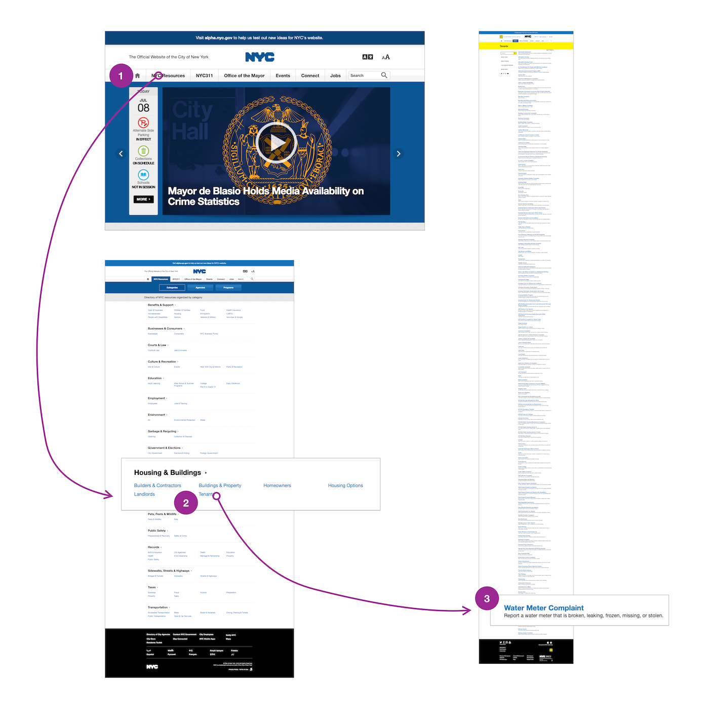
Above: One such example of information which can be found within 3 clicks, yet yeilds an unwieldy experience. Image courtesy the Nielsen Norman Group.
What is true – users want to do the least amount of work or expend the least amount of effort, both physically (clicks) and cognitively (thinking about what to click). Furthermore, evidence shows that not all clicks are created equal. Five clicks that require less brainpower is arguably better than 3 clicks made up of cognitively demanding decisions or precise UI elements.
The takeaway here is that instead of focusing on reducing click count, we should be increasing ease of clicks. A few suggestions for creating easy clicks include:
Clear/Intuitive Text Labels – the text we put in links, buttons, nav elements should be instantly meaningful, even to those unfamiliar with the context.
- Shorter words/phrases tend to be better than longer
- Most important elements should be first
- Avoid using technical terms or jargon
The Structure Matches Mental Model
– In other words, it should be obvious.
- If users are looking for “Men’s Socks,” within the context of an apparel store Men, not Socks, is likely to be the first category they are looking for (unless of course the store only sells socks).
Clear Wayfinding
– Users should feel like they’re making progress – what good is a one-page form or check-out if the user is overburdened by the length of the form and never completes it? Instead of overwhelming their path with information, provide the user with:
- Breadcrumbs or a breakdown of the steps so they can track progress
- Don’t: Make the user start over at the beginning if they make a mistake.
- Instead: Break long tasks into several steps with landing pages that give context and provide local navigation as well as are easy to navigate back to should the user make a wrong click.
Often, one of the first tasks we encounter with a new site build or redesign is defining the category structure or incorporating an existing category structure within a navigation system. This is especially important within the context of eCommerce, as a well-thought-out category structure is critical to the shopping funnel and may not make a site, but will definitely break one. Creating a category taxonomy is akin to map making as it’s only once an area has been defined that we are able to accurately and efficiently provide directions to it. Clear and intuitive navigation should take precedent and will serve to inform display and placement decisions throughout the UI.
A few good navigation practices to follow include:
- Menu and navigation labels should be clear and familiar. Avoid vague, made up, or branded terms as well as industry or technical jargon.
- Include clear pathfinding such as breadcrumbs or local sub-navigation that shows users where they are currently within the overall category structure.
- Avoid error-prone multilevel hierarchical dropdown menus in favor of mega menus or navigation that only displays one level of the taxonomy at a time.
- Identify the most important information seeking tasks and link to them from high priority pages such as the home page and other prominent landing pages.
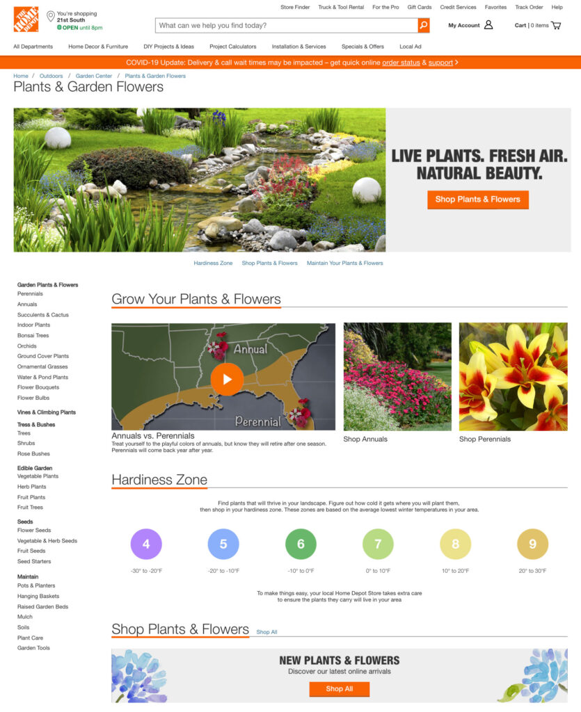
- For complex workflows and pathways, provide clear progress indicators as well as utilize landing pages to serve as information hubs that are easily retractable (see above example from Home Depot).

Above: This multi-level menu from Walmart.com is a perfect example of what not to do. Not only is the multi-tiered hover nav difficult to physically use, but by showing 3 levels of taxonomy it overwhelms the user with options creating a cognitively demanding task. Compare with the below example from Bonobos, which is coincidentally owned by Walmart.
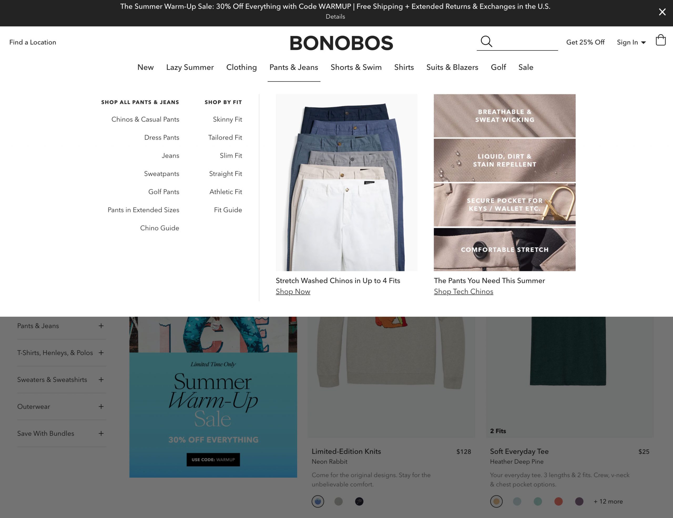
Above: Bonobos is utilizing a mega menu to make a much easier, more visual experience. They are presenting options both by type and by fit as well as promoting popular categories all in a manner that reduces cognitive load.
For more on when and how to abandon the 3-Click Rule, read The 3-Click Rule for Navigation is False from Nielsen Norman Group, as well as watch the video from NNG below.

