
With it being easier than ever for people to open up their services to the world with a website, it’s certainly helpful to understand some of the front-end principles and tips to make their efforts work harder.
Contents
Start loose and iterate
When tackling a redesign or building a site from the ground up, in the interest of saving time and jumping right into it, the design process can tend to get digital and precise too soon. Just as you don’t fixate over the decor and accessories before the blueprint of a space is established– the same thinking applies here.Start with simple pen and paper and sketch loosely and quickly, uncovering different options, focusing on the high-level experience and problems you’re trying to solve for. There’s no good in designing something that looks pretty but lacks practicality and provides no added value for your user. Revisions will always happen as you move throughout the design process, but it is with this lo-fi first approach that:
- More solutions are explored
- Anyone can do it; no special software needed. Making it an easier collaborative exercise across stakeholders
- Fewer distractions
- Detaches you from “but it looks pretty like this”
Think mobile
It’s no surprise anymore how many people will make contact with your site via mobile devices. We all know this but can tend to still leave mobile design and solution thinking until the end. So what do these mobile considerations entail besides considering the different proportions of your content?
-
- Touch targets- Fingers are much wider than a desktop cursor so buttons and the spacing between buttons should be a comfortable size for the thumb in order to avoid accidentally tapping another touch target. Google suggests a minimum of 48×48 pixels and an 8-pixel distance between buttons both horizontally and vertically.
- Content priorities- Assigning primary, secondary and tertiary importance to content. What information is kept visible and what will have to be expanded to view more, what belongs on a separate page, etc.
- Don’t rely on hover effects- They work great on a desktop, but when the functionality gets stripped on mobile the content should be able to stand on its own.
- Font size- A good rule of thumb is a 16pt size for body copy. While a smaller size can fit more text, chances are the user will skip over that and not squint through the copy. Larger than 16 for body copy will cause the eye to move more across the screen through fewer words and that’s not great either.
- Simplify- Phones generally load content slower than a desktop, so it’s not wise to make your user jump through too many hurdles to get to their end point. Attention spans are short, and if it takes too many clicks and digging from point A to B they’ll most likely give up.
But also, think global
Of course, thinking mobile is not to take away from considering how the content works on larger screens. Desktop still accounts for 43.2% of online traffic (as of August 2018) and conversions continue to happen here in most industries so it’s important to consider all the different viewports.
Design is influence
A Shop Now button here, Subscribe button there and a few calls to action and headlines later, could have your site looking and feeling a bit overwhelming. The goal is always to provide value and ease and if all the content is trying to compete with each other for attention, it ends up drowning itself out like a walk through Times Square.
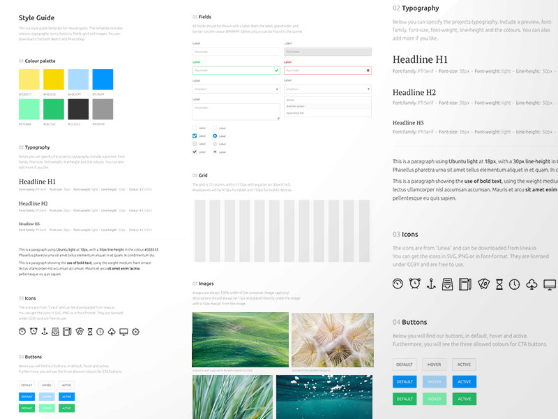
Design (in any space) is very much about guiding the eye with the use of shapes and colors, so it’s important to pare down button styles, heading styles, color palette and assign a hierarchy to achieve structure and order. A design system not only is effective in a visual sense but exists to make life easier when building page after page. To a non-designer, it may seem like the more varying colors and text styles the merrier but the eye needs the white space and the structure to know what to read or see first and how to navigate and sort through what they need.
Words matter
Copy and design work hand in hand. Design impacts the copy written for that space and the same applies the other way around. It’s certainly a dance copywriters and designers know all too well if they’re working together. Other times its one person doing both and it’s important to have the messaging in mind when designing. If it’s a product or idea that requires more explaining you may need to dedicate a page to where a more well-known or simpler product gets by with a line of text.Things to consider when writing for your site:
- Believe in “you”– Bring your reader into the narrative and establish a relationship with them by speaking to them with the word “you”. It’s great to know what your product or service will bring to the table, but ultimately it’s about their relationship with the product.
- Don’t sound too smart- It’s generally good to aim for a 5th-grade reading level when writing unless you’re in a pretty technical environment. Edit down your vocabulary- if there’s a simpler, shorter way to say it, your audience will appreciate it.
- Edit- Riding along the last point, be gracious with the time people spend on your site and don’t assume they’re here to read. Break copy up, edit it down and keep it simple.
 And we can’t forget about SEO. All the above without an SEO strategy could leave your efforts in the quiet dust of Google page 6. In fact, SEO is so crucial your best move is to start thinking about it since the fundamental stages of your site build.
Thank you for reading and we wish you success with your web development project! Do you need additional help? Please get in touch with us here at DCKAP, we’d love to hear from you!